The dos and don’ts of personalization on your website
Sep 20, 2023 | Website Recommendations, Site Search

In today’s E-commerce landscape, Website Personalization is completely essential to drive conversions and create a much better user experience. In fact, personalized modules are responsible for an 80% increase in page visits and a 52% increase in online revenue.
But if you’re not doing personalization right, you may accidentally be creating the kind of frustrating experience you’re trying to avoid!
To help you out, one of Raptor's most experienced personalization experts has collected the most important dos and don’ts of website personalization.
Do:
1. Decide whether to push variants or show alternatives
If you’re selling a t-shirt, there’s a big difference between pushing color variants or an alternative t-shirt model. If you have a variant picker showing which colors the customer can choose from, you should make sure the recommendation module instead pushes other t-shirts – and not colors.
2. Make sure that recommended accessories match
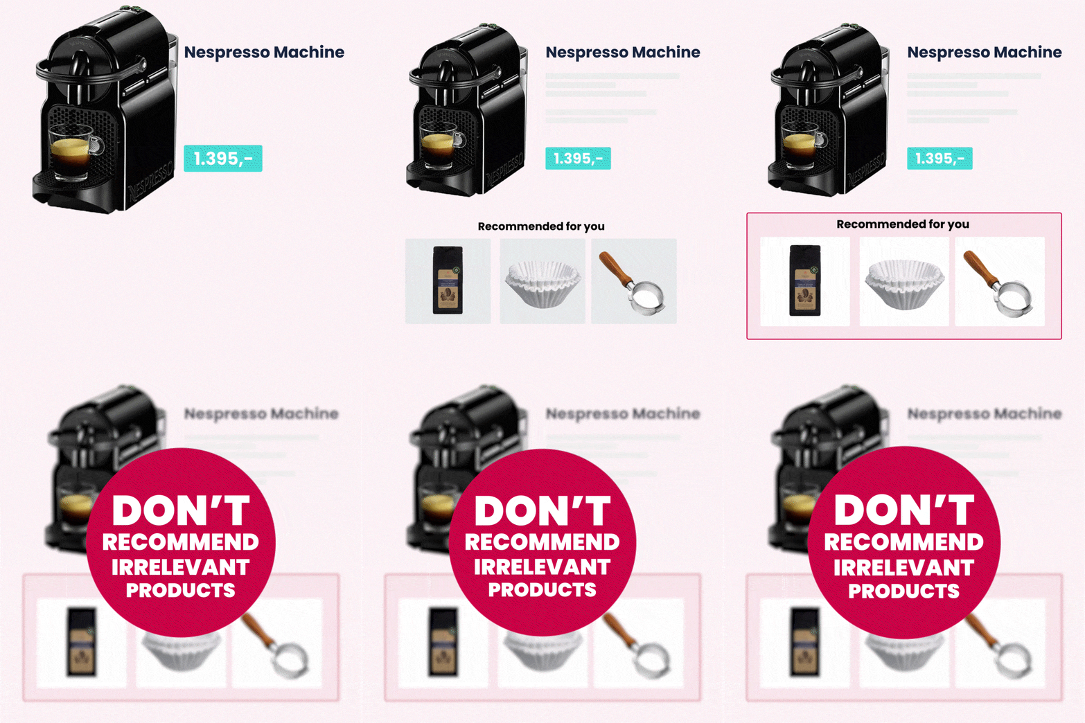
When an item is added to the basket, it’s important that any accessories you try to cross-sell actually go with it. This is especially true for electronic items, where the customer risks buying an accessory that is completely useless if it’s not compatible with the item it was bought with.
Raptor’s advanced algorithms take into account a large variety of purchasing data and product information to make sure your products match - an action that truly elevates the shopping experience.
3. Utilize Cross-Selling in your recommendation modules
Once you have made a sale, make sure the sales momentum doesn’t end there.
Instead, your recommendation modules should shift to showing relevant accessories that the customer likely needs.
4. Respect Click & Collect Availability
Click & Collect is a popular and convenient option for shoppers who want to save shipping costs and pick up their order in your store.
But when the user has chosen a product to pick up in their chosen store, it’s important that they are only shown products with the same in-store availability and shipping time. Otherwise, the user may get a frustrating surprise when their chosen items are not actually available for pick-up.
5. Boost brands – but be careful
Retail Media is one of the biggest buzzwords in e-commerce right now – and for good reason! It’s a great way to create a new revenue stream and improve relationships with the brands you sell.
However, it’s very easy to ruin a great recommendation module by boosting brands too much. Your customer might see a certain brand or product everywhere, but at the expense of relevance. That’s why you should make sure to balance brand boosting with personalized recommendations.
Merchandising is the perfect tool for this – read more about it here
6. Consider Price Sensitivity
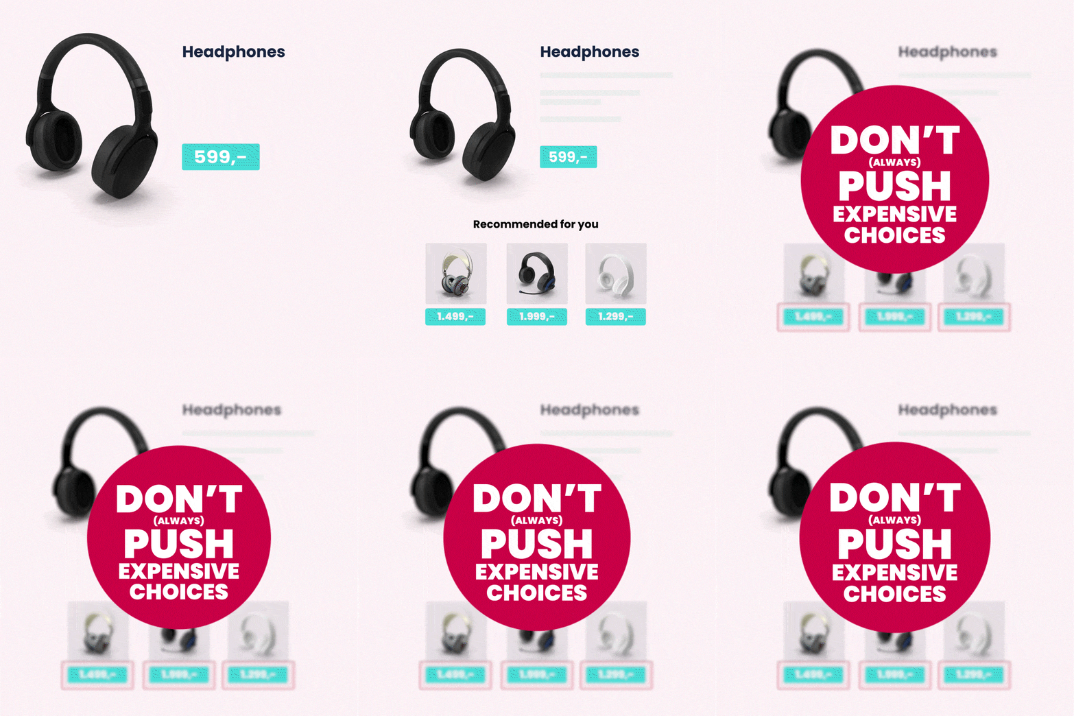
Your visitors’ shopping habits tell you a lot about their price sensitivity – and your recommendations should respect that!
If you sell products at various price points, set your recommendation modules to not push significantly more expensive products than the user has bought before. If the product is way out of budget, they’re simply not going to buy it.
7. Trust the algorithm
You may think you have a clear idea about how your customers shop but trust us – the algorithm knows better. After all, recommendations are based on actual data about customer behavior, and the patterns that show up might surprise you.
If you insist on frontfilling with your own rules and assumptions, you might be missing out on sales. That’s why you should let go of your previous assumptions and study the data that your recommendations reveal.
Don't:
1. Don’t show sold-out products
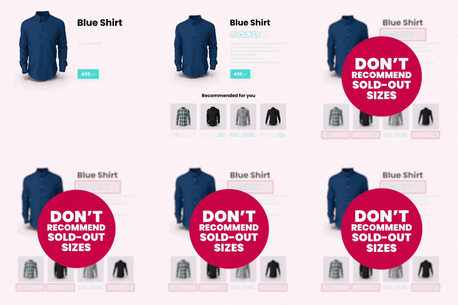
Clicking on a product and realizing that it’s out of stock is a frustrating experience – and it doesn’t lead to a purchase.
Instead, make sure to suppress sold-out products from your feed – unless you have a specific tactic in place, such as offering customers the option to be notified when a product is back in stock.
Better yet?
Implement a “Back in stock” trigger into your e-mail setup. This specific tactic automatically notifies your customer when a product they have shown interest in is back in stock.
In fact, Zizzi saw a +8,37% increase in Conversion Rate with a Price Drop trigger!
2. Don’t push products that are low in stock
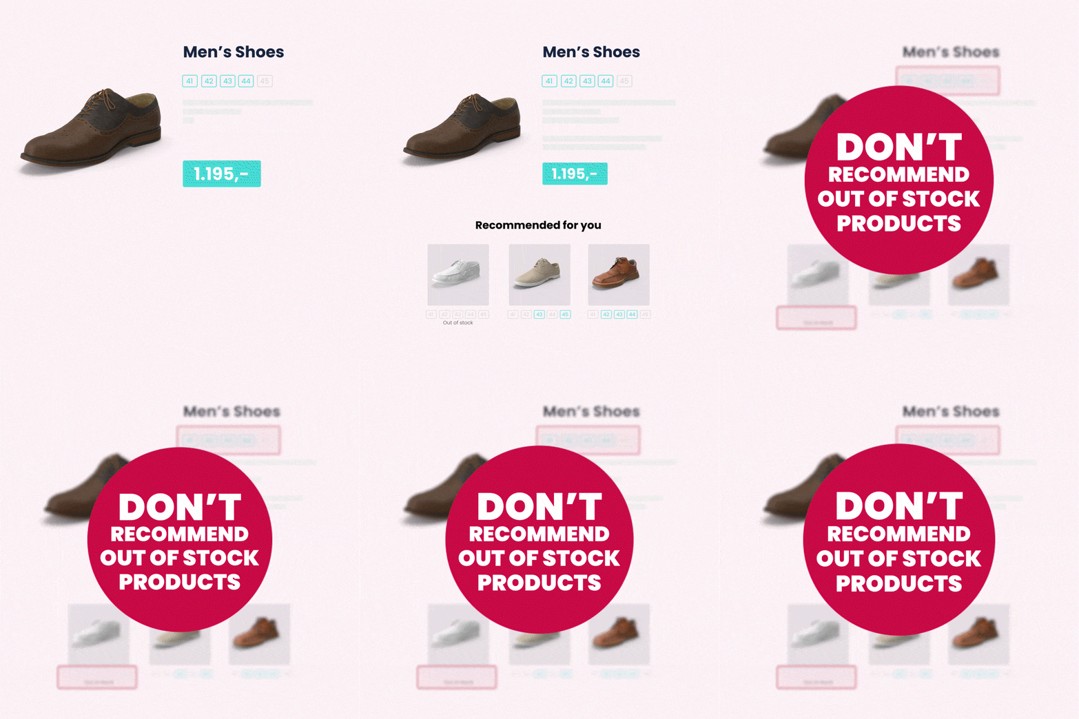
The same goes for products with low availability or only a few sizes left.
For fashion, we always recommend suppressing products with less than three sizes left, especially if these sizes are at either end of the scale (like XXS or XXL). Instead, we recommend pushing products with high availability in the sizes that fit most users. This is to make sure that the majority of your visitors will see products that are available for them to buy.
3. Don't Cross-Sell Before Making a Sale
Don’t sell the matching bag before selling the dress. This sounds like a no-brainer, but many retailers get it wrong in their recommendations.
Here, the placement of your modules means everything. When the visitor is in the browsing phase, make sure that the module showing alternative products has a very visible position on the product page. Once they place their preferred item in the basket, products for upselling should get the most visible position – for example on the basket page or any other product page visited during the session.
Trust us, a simple change in module placement can give your conversion rates a gigantic boost.
4. Don't push popular products that the customer will buy anyway
We all have our basic products that most customers will buy automatically. Depending on what you sell, these could be a carton of milk, a pair of white socks, or a roll of duct tape.
And this creates a problem if your modules are set to promote popular products: Your modules will quickly fill up with popular but irrelevant products that the customer would have found by themselves.
A great personalization solution gives you the option to tune the balance between popular and personalized products. We call that solution Serendipity, and you can learn more about that here.
5. Don’t forget to make sure all items in your product photos are easy to find
Your product photos provide a lot of inspiration for visitors looking for ways to complete the look or create the perfect setup. Don’t miss out on a possible cross-sale by making it easy to find the other products in your images.
We recommend showing the featured products in one of your top modules on the product page to make sure they are easy to find. Otherwise, you might send your visitor on a wild goose chase around your website, frantically searching for that matching skirt (and you don’t want that).
What are the differences between Recommendation and Personalization? Find out here!
Feel inspired?
By following this list of best-price dos and don’ts, you are well on your way to creating a high-performing, personalized customer journey that outperforms the competition second to none. But do you still lack the right solution to bring these e-commerce ideas to reality?
Book a free demo with one of our skilled consultants.
We have over 10 years of experience helping retailers like you create a premium personalization experience on their websites.
Related Content
You might also like
Do you transform your Black Friday encounters into lasting relationships? Or do you let this annual...
Learn More
Sustainability and e-commerce. To many, they’re considered close to mutually exclusive. But they...
Learn More
It’s a common myth that B2B Salesdon’treally need a proper digital setup. After all, “people buy...
Learn More
No reason to sugarcoat it. E-commerce is facing a lot of challenges right now. Chinese giants like...
Learn More
It’s a name that’s impossible to ignore. No matter how hard you try. TEMU. The Chinese giant has...
Learn More
In the dynamic world of digital interactions, businesses are constantly striving to capture the...
Learn More
What is Site Search in E-commerce? Site search in E-commerce is when a search engine is integrated...
Learn More
Raptor is proud to present our most advanced recommendation module to date. Find out what the new...
Learn More
Is your brand using Salesforce Commerce Cloud? And are you wondering what your options are in terms...
Learn More
If you're ambitious in your marketing strategy, you've probably already heard of omnichannel, or...
Learn More
Let us show you what you can achieve with premium personalization


A Raptor expert can share more about the product and answer any questions you have.


